Focal Point
-focal point draws your attention to the most important element on the page.
Choosing the Font:
Selecting the most appropriate type style is important to the overall message of your design. The type provides the link between the designer and the audience.
Five factors to consider when choosing a typeface:
(1) Legibility
(2) Readability
(3) Appropriateness
(4) Reproducibility
(5) Practicality
Illustrator
Demo for Logo
Wrap tool
Twirl Tool
Pucker Tool
Bloat Tool
Scallop Tool
Crystallize Tool
Packaging design
is an area than covers everything from labels to bags to boxes of all shapes and sizes.
the primary goal to attract customers’ attention.
Successful product design manages to reveal useful functionality beyond its appealing form.
Steps:
1) Research the product
2) Begin the initial mock-ups/thumbnails
3) Sketch in the computer
4) Fine tuning the design
5) At this point you would show the client
6) Complete the projects
Points to think about in Package Design:
1) Message
2) Presentation
3) Structure
4) Brand Artifacts
Homework:
Continue on your Logo, they are due at the beginning of next class, November 16th.
Read pgs from Thinking with Type: (pg 90-111)
For those of you who are ahead of the projects or for those of you who want an extra credit project, you can work on a package design. The extra credit can add up to five points to your final grade.
Tuesday, October 28, 2008
Wednesday, October 15, 2008
Week 8 - November 2
Lines
Lines are one of the basic elements of design. Alone or in combination with other lines or shapes they can aid in the readability, appearance, and message of a design.
Use lines to:
- Organize
- Texturize
- Guide the eye
- Provide movement
- Make a statement
- Convey universal meanings
Lines can be horizontal, vertical, or diagonal. Lines can be solid, dashed, thick, thin, or of variable width.
Whether lines appear as part of a graphic element, such as a logo or illustration, or the lines themselves are the graphic element, such as frames and dividers, use them purposefully in the overall design.
Some ways that you might use lines in your design are to:
- Organize, connect, and separate
- Create movement
- Provide texture
- Convey a mood or emotion
- Define shapes
- Provide emphasis
- Provide a framework
Logo Design
Logos are the centerpiece of a company’s brand image and can tell you a lot about the company. Creating a logo requires a lot of thought.
A Great Logo Must Follow Basic Design Principles - think of your Elements of Design and your Principles of Design.
A Great Logo Must Be Functional:
It’s describable.
It’s memorable
It’s effective without color.
It’s scalable
It’s appropriate
Getting Started with logo design
Research & Brainstorming
Sketching (Thumbnails)
Prototyping & Conceptualizing
Revise & Add Finishing Touches
Illustrator
Effects > they will increase your file size
Stylize
Wrap
Distort and Transform
Convert Shapes
3D
Photoshop Effects
Homework:
Logo Design due Nov 16 th, thumbnails sheet is posted on the SJU Central. You should have at least four sketches.
For those of you who are ahead of the projects or for those of you who want an extra credit project, we will go over package design next week. Start thinking about what kind of package you would like to design. The extra credit adds up to five points to your final grade. Examples – Shoe or Accessory boxes, beverage and food cans or cartons, DVD boxes, CD Cases.....
Sunday, October 12, 2008
Week 7 - October 26
Composition
Some easy ways to achieve unity in your compositions include:
Similarity
Continuity
Alignment
Proximity:
Unity
Unity within a well-composed design accomplishes two things
1) Unity creates a sense of order.
2) Unity also gives elements the appearance of completeness that they belong together
When unity is achieved:
The individual elements with in a composition will not be competing for attention.
The key theme will be communicated more clearly.
The design will evoke a sense of completeness and organization.
Illustrator:
In class Flower Demo to learn tools
Pen tool
Blend tool
Copy, Paste Drag
Pathfinder > create shapes
Graphs
Start our Event Flyer in Class:
Students will collect graphical elements, write copy and create advertisement for a one-page flyer (8.5 x 11) announcing an event-taking place on campus or within the community.
Information you event might have:
Title, Date, Time, Location, Cost, Guest Star, and description of event
Homework:
Continue working on your project- this project will be due by the end of class next week, November 2nd.
Monday, October 6, 2008
Week 6 - October 19
Midterm Presentations:
Illustrator
Illustrator Help
In class project to use these
Illustrator Class Project
Selection, Rectangle
Fill/Stroke
Bring Forward / Send Backward
Swatches and Brushes
Text
Setup File
Ways to save - .eps or .ai
Homework:
- Create three Thumbnails for Event Flyer, we will be creating this project in Illustrator (Template on SJU Central)
- Students will collect graphical elements, write copy and create advertisement for a one-page flyer (8.5 x 11 at 300 res) announcing an event-taking place on campus or within the community.
Information you event might have:
Title, Date, Time, Location, Cost, Guest Star, and description of event
- Read pg 48-61 from Thinking with Type
Saturday, September 27, 2008
Week 5 - October 5
More Color
Chromaticity
- Monochromatic
- High Chroma
- Low Chroma
-Constant Chroma
Saturation
Luminance
Tints, Tones and Shades
Subtractive vs Additive
For more information on color and visual diagrams:
http://www.colorcube.com/articles/theory/glossary.htm
Review the up coming Midterm, and go over any question anyone has in Photoshop
Homework;
Midterm project due and to be presented in class next week (October 19th).
Your Promotional Mailer (4x6) will be handed into me on a 8.5 x11 paper. No printing will be allowed during this class time, have them printed out before class. No thumbnails are required for this project.
Also bring your pdf file of both your Promotional Mailer (4x6) and your Commercial Poster (24x30), to place on the screen while presenting your work. Let the class see your original design and how you have changed it around to fit a design on a smaller scale.
Get prepared to present your work – Let us know what mood you created for your piece through the use of color. Tell us why the design works using color theory, the principles and elements of design, the principles of typology. Also whom you think your intended audience would be for this ad.
We will start at the beginning of class, so be on time and ready to present your project
Your project (70%)and presentation (30%) will determine your midterm project grade.
Midterm - Commercial Mailer (Photoshop)
Students will design a 2-sided Promotional Postcard (4x6) based off their Commercial Poster for a real film, play, artist show or concert. In this project you will redesign your commercial poster to the new dimensions of the mailer. Not all the same elements need to be in the mailer
Read pg 34-47 from Thinking with Type
The rest of next weeks class will be going over Illustrator, and introducing our next project, Newsletter or Event Flyer of an event-taking place on campus or within the community.
Sunday, September 21, 2008
Week 4 - September 28th
Color
The properties of color are hue, value, intensity and temperature.
Hue
- are either chromatic or achromatic.
- Neutral colors
- Hue Contrast
- Hue Constant
Value
- Low Value, Constant
- Contrast of Value
Intensity (Saturation)
Temperature
For more information on color and visual diagrams:
http://www.colorcube.com/articles/theory/glossary.htm
More Photoshop
Filters
Eye Dropper
Liquify
Type Effects
Burn/Dodge
HW:
Your Commercial Poster (24x30) is due on October 5th. The next project we will work on is resizing this one to create the Promotional Mailer (4x6) that is based off your Commercial Poster, which will be due the following week and is your midterm.
Read pg 25-33 the following sections from Thinking with Type
Sunday, September 14, 2008
Week 3 - September 21
Typography: :
is the art and techniques of arranging type, type design, and modifying type.
In choosing typography, you must: :
- Select a font (or typeface)
- Choose a font size
- Decide how much space to allow between lines of type
- Determine how much contrast (Different fonts)
Principles of Typography
- Type Size
- Weight
- Style
- Leading
- Alignment
- The Color of Type
Kerning vs Tracking
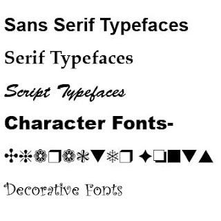
Kinds of Typefaces
- Sans Serif Typefaces
- Serif Typeface
- Script Typefaces
- Character Font
- Decorative Font
Typography Tips and Techniques
Photoshop:
- Effects in layers Style
- Image Size vs Canvas Size
Homework
- Read the pg 12-24 from Thinking with Type
- The Commercial Poster will be due on Oct 5th. Sketch out Four Commercial Poster Thumbnails, remember this is part of your project grade.
Project: Students will design a Commercial poster (24x30) for a real or functional film, play, artist show or concert. Along with a good choice of graphic elements, greater emphasis should be placed on the use of color to create a mood that underscores the subject of your design
is the art and techniques of arranging type, type design, and modifying type.
In choosing typography, you must: :
- Select a font (or typeface)
- Choose a font size
- Decide how much space to allow between lines of type
- Determine how much contrast (Different fonts)
Principles of Typography
- Type Size
- Weight
- Style
- Leading
- Alignment
- The Color of Type
Kerning vs Tracking
Kinds of Typefaces
- Sans Serif Typefaces
- Serif Typeface
- Script Typefaces
- Character Font
- Decorative Font
Typography Tips and Techniques
Photoshop:
- Effects in layers Style
- Image Size vs Canvas Size
Homework
- Read the pg 12-24 from Thinking with Type
- The Commercial Poster will be due on Oct 5th. Sketch out Four Commercial Poster Thumbnails, remember this is part of your project grade.
Project: Students will design a Commercial poster (24x30) for a real or functional film, play, artist show or concert. Along with a good choice of graphic elements, greater emphasis should be placed on the use of color to create a mood that underscores the subject of your design
Subscribe to:
Posts (Atom)